Room 11’s study into Piet Mondrian and his famous abstract art.

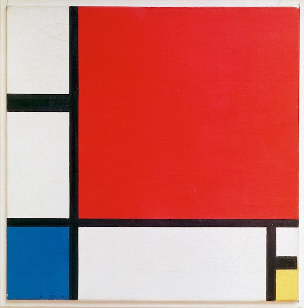
Piet Mondrain was a painter who began painting trees. Growing up in The Netherlands, he looked out his window and saw the world differently, not in branches and trunks, but lines and colours. In fact, as Room 11 found out, Piet Mondrian saw things so differently, he created his own style; Neoplasticism.
Neoplasticism is an art style based around thick lines and the primary colours of red, blue, and yellow.
Neoplasticism is a kind of cubism. You can tell it’s cubism because they use squares and rectangles to represent things - Lucas.
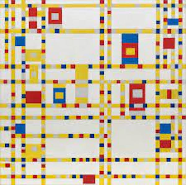
Room 11 began by looking at the famous painter, and unpacking what they interpret from each famous artwork.

You can tell it looks like we are looking from the top of the city, down at all the people and the cars - Michael
I can see the yellow taxis in the street - Josef
Mondrian was famous for his particular style, using mainly primary colours and straight, bold lines.
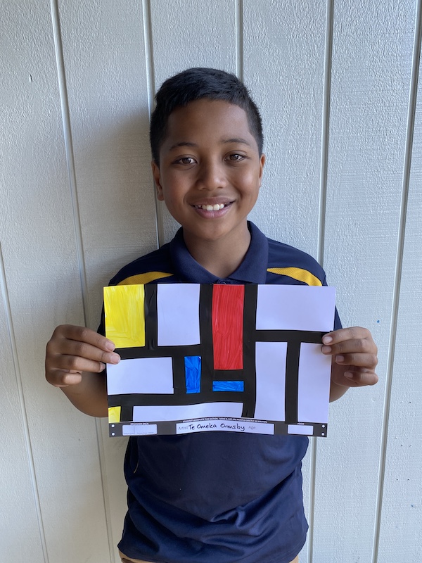
To appreciate this deeper, the students in Room 11 tried their hand at creating their own Mondrian art in the form of a bookmark. Focussing on the bold lines, and solid colour, they created their own bookmarks.
The students watched an interesting video that told them about why Mondrian used lines to represent the real world. Mondrian began with one of his famous tree paintings, and noticed that the branches and the horizon made bold, intersecting lines. It turns out that everything can be represented by lines in nature if you know how to look.
The students tried this themselves.
They were challenged to use a Mondrian style to create a picture of the surrounding school grounds. The students looked carefully at their school environment, and what colours they saw.
I wanted to use pink, so I had to find the only pink I could see. Juno has pink glasses so I represented Juno as a pink square and the red square in the corner represents the tree - Nevaeh
Finally, the students were tasked with representing a special place to them, since Mondrian’s famous Boogie Woogie artwork was based on New York City, a place he loved.
Students chose a range of places. Emma chose Ohope Beach, Declan Five Mile Bay, Josef’s favourite place was a rugby field.
They took care planning their ideas, and presenting their artwork onto the paper ready for calendar art.
Once they had their outlines, they were ready for the final touch - a lick of paint.
This didn’t take long as the artwork had a lot of white in it. The colours that were chosen meant a lot and the students were challenged to be able to explain what each colour section represents, and why they chose each colour.

Key Words: Primary Colours, line, painting, Mondrian

Comments are disabled for this post.